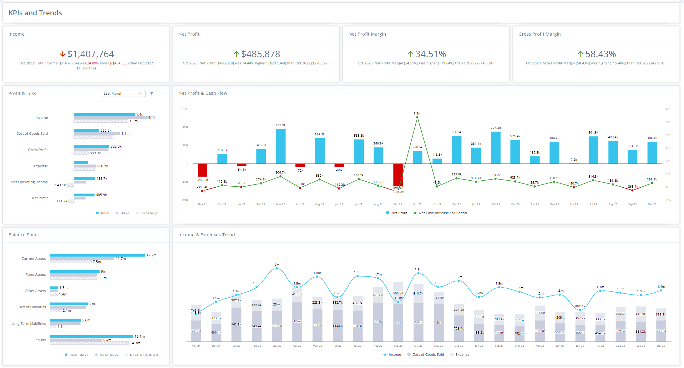
Creating Impactful Visuals
Data visualization is a powerful tool that transforms complex data into clear, actionable insights. However, visualizations must be designed with intention and clarity to be effective. Here are the best practices for creating impactful data visualizations:
Understand Your Audience
Why It Matters: Different audiences have varying levels of data literacy and specific needs. Tailoring your visualizations to your audience ensures they can interpret the data accurately and make informed decisions.
Best Practice: Identify who will view it before creating a visualization and what insights they need. For executives, focus on high-level summaries; for analysts, provide detailed data.
Choose the Right Visualization Type
Why It Matters: The type of visualization you choose directly impacts how the data is interpreted. A poorly chosen chart can mislead or confuse the audience.
Best Practice: Use bar charts to compare quantities, line charts to show trends over time, pie charts to show proportions, and scatter plots to show relationships between variables. Selecting the appropriate type ensures clarity and effectiveness.
Prioritize Simplicity and Clarity
Why It Matters: Overcomplicating visualizations with too many elements can obscure the message. Simplicity helps the viewer focus on the most important information.
Best Practice: Avoid clutter by limiting the number of colors, fonts, and data points. Use clear labels and legends, and ensure that the most important data stands out.
Use Color Intentionally
Why It Matters: Color can enhance or detract from a visualization depending on how it’s used. The right color scheme guides the viewer’s attention and makes the data more digestible.
Best Practice: Use color to highlight key data points or trends. Stick to a consistent color scheme that aligns with your brand or the message you want to convey. Avoid using too many colors, which can be distracting.
Focus on Data Accuracy
Why It Matters: A beautiful visualization is useless if it misrepresents the data. Accuracy is paramount in ensuring your audience trusts and acts on the presented information.
Best Practice: Double-check your data sources and calculations. Ensure that scales, axes, and data points are correct and that the visualization accurately reflects the data.
Tell a Story
Why It Matters: Data alone can be dry and hard to interpret. Framing your visualization within a narrative context makes it more engaging and easier to understand.
Best Practice: Structure your visualizations to tell a story—begin with the problem, present the data, and conclude with the insights. This approach helps guide the viewer through the data logically and clearly.
Understanding When Metrics Are Right and Choosing the Right Graphs
Selecting the appropriate metrics and visualizations is crucial for effective data communication. To determine if a metric is right, consider whether it aligns with your business goals and the questions you’re trying to answer. The right metric should provide actionable insights and be relevant to the audience.
- Bar Charts: Use for categorical comparisons or showing changes over time. Ideal for datasets with clear differences.
- Line Charts: Best for illustrating trends over a period, especially with continuous data.
- Pie Charts: Suitable for depicting parts of a whole but should be used sparingly and with a limited number of segments for simplicity.
- Scatter Plots: Ideal for examining relationships or correlations between two variables.
- Histograms: Useful for showing frequency distributions of a single variable.
- Area Charts: Similar to line charts but better when you want to show the magnitude of change over time.
- Bubble Charts: Great for adding a third dimension to scatter plots, such as size to represent another variable.
- Heatmaps: Best for visualizing data intensity across two dimensions, like performance metrics across different categories and time frames.
Reach Reporting for Superior Data Visualization
Creating impactful data visualizations is easier with the right tools. Reach Reporting offers advanced features that allow you to design clear, accurate, and effective visualizations tailored to your audience’s needs. Whether you’re building dashboards or standalone reports, Reach Reporting helps you easily transform complex data into actionable insights.
Ready to take your data visualizations to the next level? Start your free trial or request a demo today to see how Reach Reporting can help you create impactful visualizations that drive better decisions.
Conclusion
Effective data visualization is key to turning raw data into insights that drive decision-making. By understanding your audience, choosing the right visualization types, and maintaining simplicity, you can create visualizations that inform and inspire action. Reach Reporting provides the tools you need to craft visualizations that are accurate and powerful in delivering your message.
People Also Ask:
Q: What are the best practices for data visualization?
A: Best practices include understanding your audience, choosing the right chart type, maintaining simplicity, using color intentionally, ensuring data accuracy, and telling a story with your data.
Q: How does Reach Reporting enhance data visualization?
A: Reach Reporting offers advanced features that help you design clear and effective data visualizations, allowing you to easily convey complex information in an actionable format. Explore Reach Reporting’s data visualization features
Q: Why is simplicity important in data visualization?
A: Simplicity ensures that the most important information is easily understood, preventing your audience from becoming overwhelmed by too much data or visual clutter. Discover the importance of simplicity in data visualization

